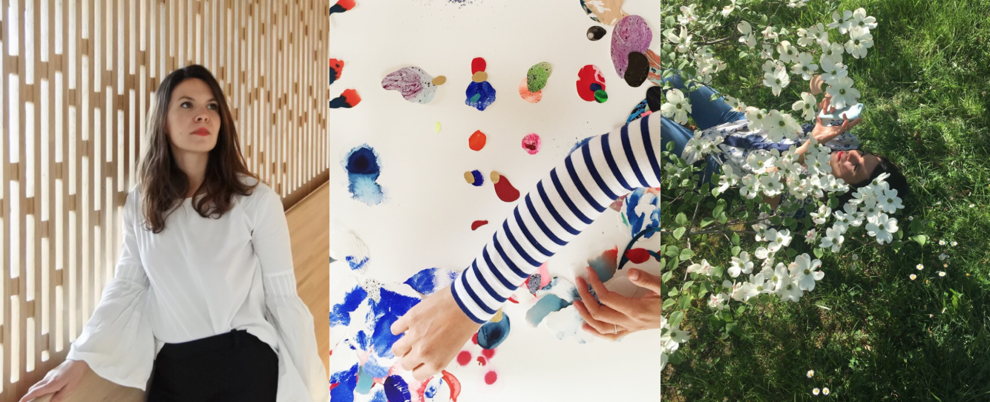

When we met Sara in Lausanne at the very beginning of the project to talk about Marelle, Sara was immediately ready to support us in our adventure! What a joy! She told us about her passion for nature and organic cosmetics, and that our Marelle brief was the brief of her dreams! Thanks again Sara for your enthusiasm from the start! And thank you for transcribing the history and essence of the Marelle brand so well!
A graduate of ECAL (Ecole Cantonale d’Art de Lausanne) and based in Lausanne, Switzerland, I am an Art Director, Graphic Designer and Illustrator. I’ve been designing visual identities for the past ten years. A branding concept is more than just a logo and a few prints; it’s a sum of details, a window onto a brand’s universe. To do quality work, I need to understand my client’s vision and find meaning in their mission. I like to work with personalities who inspire me. I’m particularly attracted to products of natural origin with high standards of quality.
It’s hard to analyze where your own inspiration comes from. I love vintage books and magazines from the 1960s to 1980s. Inspiration often comes from experimentation. I try to test creative avenues using paint, photos, collage, drawing, images from botanical archives or directly from nature. I’m particularly fond of botanical gardens. The tropical greenhouses at Kew Gardens in London are impressive.
I always try to keep things minimalist and to the point, to keep a clean line in my work.

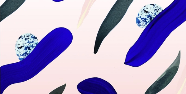
One of Sara Thom’s organically inspired creations.
I was immediately enthusiastic about the Marelle project. Right from the start, the vision of the project was clear, and that helped a lot in knowing where to go. The key words are quality and respect for the environment. It’s very satisfying to work for a high-quality product. Marelle products are certified by Cosmos Organic – one of the most demanding labels. All Marelle products are manufactured in Switzerland to exacting standards. The notion of purity is also important. It’s essential for me to find the essence of a creation. It’s a good guide so I don’t get lost in the project.
What’s more, Vanessa has a wealth of experience in the luxury goods and cosmetics industries.
Vanessa had mentioned in her brief that she wanted to discover a herbarium of Swiss plants: edelweiss, imperatorium and chamomile. Observing plates at the Lausanne Botanical Garden helped me identify the geometric shapes of flowers. I also researched vintage decorative lettering in children’s books from the late 19th century to the 1960s.

Sara Thom’s studio in Lausanne.
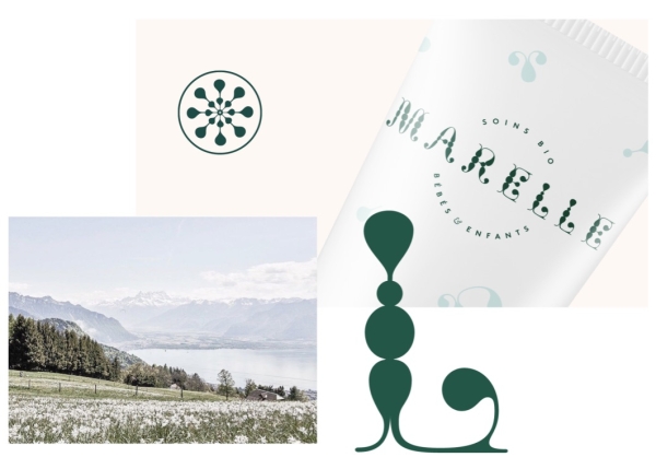
The fusion of these two ideas – natural geometric shapes and vintage lettering – gave birth to the Marelle typography and motif. The Marelle logo is therefore a combination of these organic shapes recomposed in lettering that subtly evokes old decorative letters. As you approach the letters, you come across organic shapes, petals, drops and stems. The pattern on the Marelle packaging is a deconstruction of these shapes. This game of construction and deconstruction brings a playful dimension to the brand, and allows us to imagine future variations. For me, it’s important to design a system that can evolve, and is therefore alive.
Playful, decorative and organic.
